![]()

大家好,我是正在实战各种AI项目的程序员晚枫。
今天继续Matplotlib进阶内容,学习如何让图表更专业、更美观。
同样的数据,普通的图表和精心设计的图表,给人的印象完全不同。掌握这些技巧,让你的图表达到汇报级别。
技巧1:设置全局样式
1 | import matplotlib.pyplot as plt |
技巧2:配色方案
1 | # 使用ColorBrewer配色(专业) |
技巧3:添加注释和标签
1 | x = np.arange(1, 6) |
技巧4:双Y轴图表
1 | x = np.arange(1, 13) |
技巧5:堆叠图表
1 | # 堆叠柱状图 |
技巧6:水平条形图+排序
1 | # 城市销售排行 |
技巧7:热力图
1 | import numpy as np |
技巧8:组合图表
1 | x = np.arange(1, 13) |
进阶用法
专业级配色方案
1 | # 使用专业配色 |
注释和标注
1 | # 标注关键数据点 |
自定义样式
1 | # 全局样式 |
避坑指南
❌ 坑1:子图间距重叠
1 | fig, axes = plt.subplots(3, 3) |
❌ 坑2:图例遮挡数据
1 | # 图例放在最佳位置 |
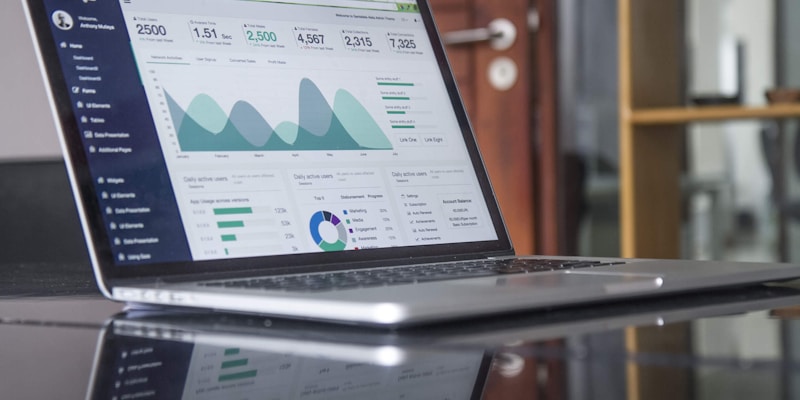
实战案例:制作年度经营分析仪表盘
1 | import matplotlib.pyplot as plt |
动画图表
1 | from matplotlib.animation import FuncAnimation |
3D图表
1 | from mpl_toolkits.mplot3d import Axes3D |
下节预告
下一课我们将学习Seaborn统计可视化,用更少的代码做出更漂亮的图表。
💬 加入学习交流群
扫码加入Python学习交流群,和数千名同学一起进步:
👉 点击加入交流群
群里不定期分享:
- 数据分析实战案例
- Python学习资料
- 求职面试经验
- 行业最新动态
推荐:AI Python数据分析实战营
🎁 限时福利:送《利用Python进行数据分析》实体书
👉 点击了解详情
课程导航
下一篇: Seaborn统计可视化-让图表更优雅
PS:好的图表不仅要准确,还要美观。花点时间调整细节,让数据呈现更有说服力。
📚 推荐教材
主教材:《Excel+Python 飞速搞定数据分析与处理(图灵出品)》
💬 联系我
| 平台 | 账号/链接 |
|---|---|
| 微信 | 扫码加好友 |
| 微博 | @程序员晚枫 |
| 知乎 | @程序员晚枫 |
| 抖音 | @程序员晚枫 |
| 小红书 | @程序员晚枫 |
| B 站 | Python 自动化办公社区 |
主营业务:AI 编程培训、企业内训、技术咨询
🎓 AI 编程实战课程
想系统学习 AI 编程?程序员晚枫的 AI 编程实战课 帮你从零上手!
- 👉 免费试看:B站免费试看前3讲,先看看适不适合自己
- 👉 课程报名:点击这里报名,现在报名还送书📖
本博客所有文章除特别声明外,均采用 CC BY-NC-SA 4.0 许可协议。转载请注明来自 程序员晚枫 - Python自动化办公与AI编程!
进群
 微信进群
微信进群